Azure IOT TSI Internship
During the summer of 2019, I interned at Microsoft Redmond on the Azure Internet of Things (IOT) Time Series Insights (TSI) team. My project was to build a scatter plot (shown above) visualization capable of displaying large sets of time-series data sourced from IOT sensors. This visualization aids in understanding trends and anomalies in time-series data. Once the scatter plot was complete, I integrated it into the team’s Time Series Insights data explorer dashboard, using React, Redux, SCSS, and TypeScript.
Over the course of the 3 month internship, I learned how to use the D3.js visualization library to create the SVG based web visualization you can see above. I learned TypeScript, a JavaScript variant that allows strict syntactical typing. I learned SCSS, a CSS extension language, making CSS styling easier and more consistent. I addition, I learned best React and Redux (a state management tool) practices from professional front-end engineers.
The scatter plot shown above visualizes 3 axes of data: a horizontal x-axis, a vertical y-axis, and radial r-axis (the diameter of each dot). This example illustrates two factories, each with three sensors transmitting IOT data (randomly generated in this case). Each factory is assigned a color and each sensor within that factory is assigned a shade of the factory color. On the left side (top on mobile) of the scatter plot, is a legend which allows the user to toggle factory and sensor visibility as well as highlight a specific sensor’s data. The legend can also be resized, which will dynamically scale each axis and its respective labels. Clicking on a sensor data point or on a sensor legend label will highlight that sensors data and lock the mouse hover interaction to target only data from that sensor.
On the bottom left of the visualization, you’ll see a toggle labeled Time Slider. If toggled to true, the plot will visualize the data in chronological order, slicing up time, and visualizing only the sensor data for a given time slice. This allows the user to visualize specific times, locating timestamps using the slider at the bottom of the plot.
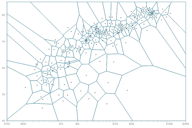
When you hover a mouse over the visualization, a crosshair and tooltip locates the closest point and gives more detailed information about the 3 axis values and that point’s timestamp. This was achieved using a mathematical voronoi diagram, which partitions a plane into regions, divided by closeness to each point on the plane. Voronoi diagrams are really cool. The image below shows the Voronoi diagram for a scatter plot with visible partitions.
Scatter Plot Showing Voronoi Diagram